simonw wrote:
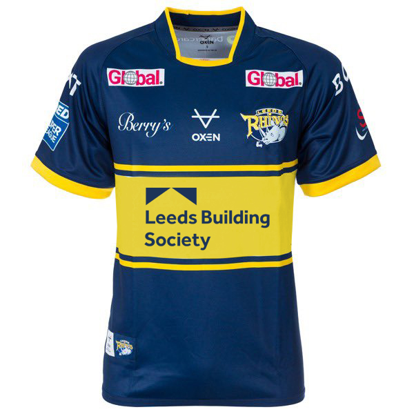
Find that big white band a bit jarring. Reckon if they'd just reversed the LBS logo as they've done previously this would actually be quite a smart kit, albeit not really Leeds blue. Their stats will have shown that the darker blue will sell better than the brighter one. Don't mind that too much but that bit white stripe is a bit distracting I think.
Yeah there's just something about the white band that looks odd
I don't overly mind the darker blue, we've used that before but would have preferred it without the white.
