


Re: 2012 Kit thread (pics and chat) : Thu Nov 10, 2011 7:28 pm
ComeOnYouUll wrote:
Sort of traditional, but superfluous thin red lines, the sponsor's logo is too large and the less said about the shorts the better.
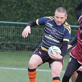
Just come from the rovers shirt launch and I'm pretty happy with them both, although that pic of Blake Green isn't great, the shorts look as though he's got a rise on!