Quote Homer Simpson="Homer Simpson"The Logo is getting dated, it needs a refresh - Here is some examples of Super League clubs that have already done it. We are being left behind
Saints


London


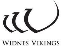
Widnes

Salford


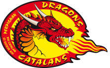
Catalan Dragons

 '"
'"
Can't put it better than Rhinoshaund III.
Plus:
Saints: Have merely updated an antiquated boring crest-type motif into a more modern boring crest-type motif.
London: Gone one better and created a slightly more interesting crest, but desperately needed to.
Widnes: Let's face it. They could have had a single letter V as a logo and it would have been better than that silly Viking picture. As it is they haven't done much more than that.
Salford: Have just removed the embarassing Sean McSatan figure along with the equally embarassing epithet, and discovered a little bit about shadow effects in the process.
Catalans: Needed fixing. The only one of these that I think is a job well done.
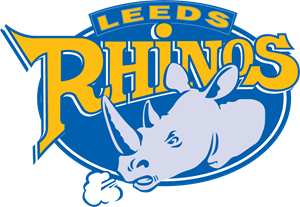
Finally Leeds: In no more need of change imo than the lettering on a box of KFC.